
On March 23rd, 2020 I published a visualization to Tableau Public called Modern Dashboard Design. It appears to have started a conversation of sorts within the Tableau community and has become quite popular. It’s created a lot of interest in what modern design is, the actual elements that contribute to it, and whether it’s a trend that should stay.
Along the way, I’ll be providing useful resources for those looking to up their UI design skills. Hopefully, you’ll come out of this with a better vocabulary for communicating this design style.
Although I created a Tableau Dashboard, it’s important to remember that most of these styles originate in web design. We’re used to navigating websites every day, finding what we want and then clicking on it. In decades prior, these seemingly simple tasks could be daunting and plagued by poor design. The user may have pushed through this frustrating experience and ultimately arrived at their destination, but many likely left the web page feeling defeated – never to return.
The goal for any User Interface designer is to create products that enable the user to achieve their objective(s) in the best way possible. This field is wide in scope and involves many different facets of design. You can read more here if you’re interested in UI design. When Ethan Marcotte created a web design approach called Responsive Web Design in 2010, the field of UI seemed to change forever. This enabled elements on a screen to adapt to new environments - meaning the same experience was easily available on your PC and phone. Eventually this breakthrough led to a new trend: flat design. This trend focused on conveying information efficiently, while still being visually appealing.
Ever since flat design came to be, UI designers have been building on this trend and have brought us to what we see today.
"Modern Design includes visual trends, adapting to usability standards and patterns, and using development techniques that are appropriate for today’s users." - Design Shack
In the next section I’ll be describing some elements that contribute to a so called 'Modern Design'.
Many of these elements will look familiar, but the implementation is what differentiates them. Not all of these elements need to be used simultaneously in order to provide a modern feel. Carefully consider the purpose for your design and whether or not these elements will efficiently lend to it.
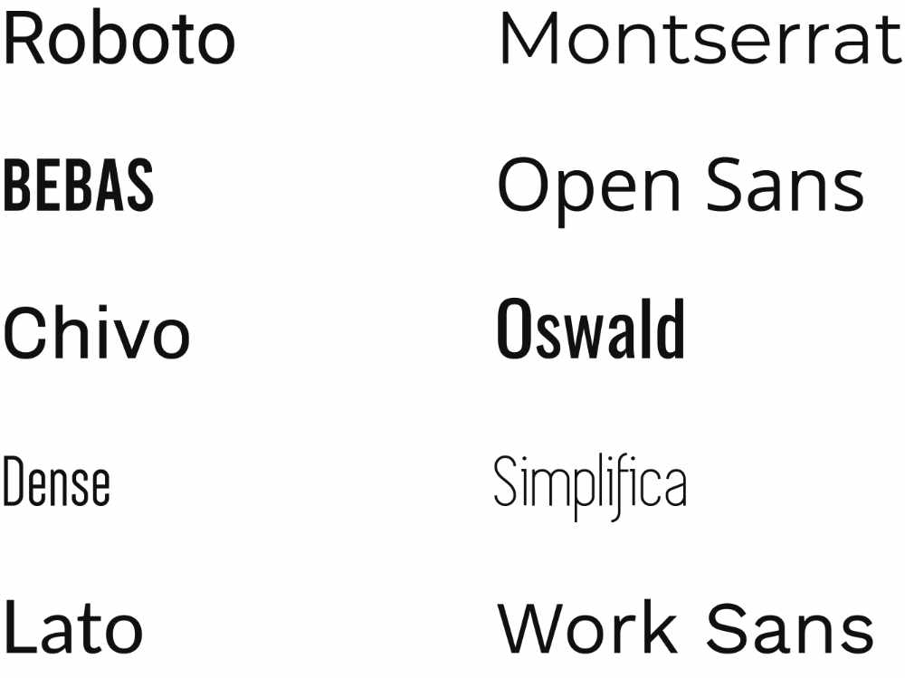
As technology has become a non-factor for web design, things slowly started to move towards enabling a pleasing user experience. Because of this, the default preferred text size has increased, ensuring users are able to read what you’re showing them.
Modern fonts embrace negative space and clean San-serif types. Here's sixty modern San-serif fonts.
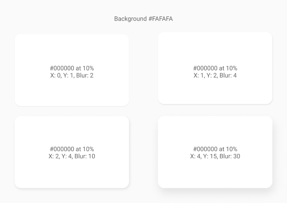
Using subtle drop shadows to encourage interaction is a nice way to draw one’s eye to a section, button, or image. The shadow appears to be coming off the object, which gives the impression that the object is raised above the objects behind it. It’s the perfect way to politely say ‘look at me,’ without having to explicitly say it. Let me reiterate subtle drop shadow; I don’t want a shadow yelling at me!
Here's a great article on the what and why of drop shadows.
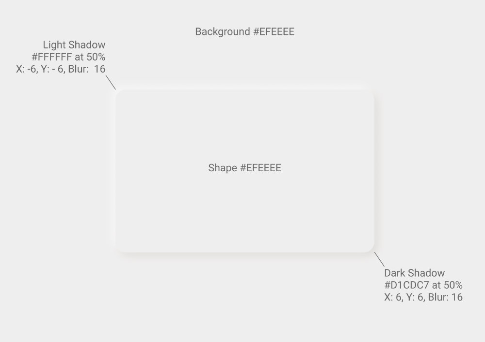
Before I give my opinion on this topic, let me first explain what it is. Neumorphism gives the impression that an object is extruding from the object behind it. This is achieved by using two shadows, one dark and one light. The effect works because it makes it seem like a light is shining onto the object, which will naturally produce one dark shadow and one light.
Should you use Neumorphism? Well, it depends honestly. An understanding of the nuances of this topic is needed to make an accurate assessment of whether or not it can be implemented in your own design. I believe if used properly it can be a great way to make your design stand out. Here are a few points on what should generally be avoided.
Avoid having a neumorphic object sit on top of another neumorphic object. Avoid using neomorphism on every object in your project. The point of using this technique is to draw attention to important sections or apply it to objects that can be interacted with. You can think of this as the visual hierarchy of depth. Avoid using different shadow directions. For example, if you had the light shadow on the upper left for one card but had the light shadow on the bottom right for another.
If you’d like to learn more on the topic of neomorphism, here’s a fantastic article that explains it more in depth.
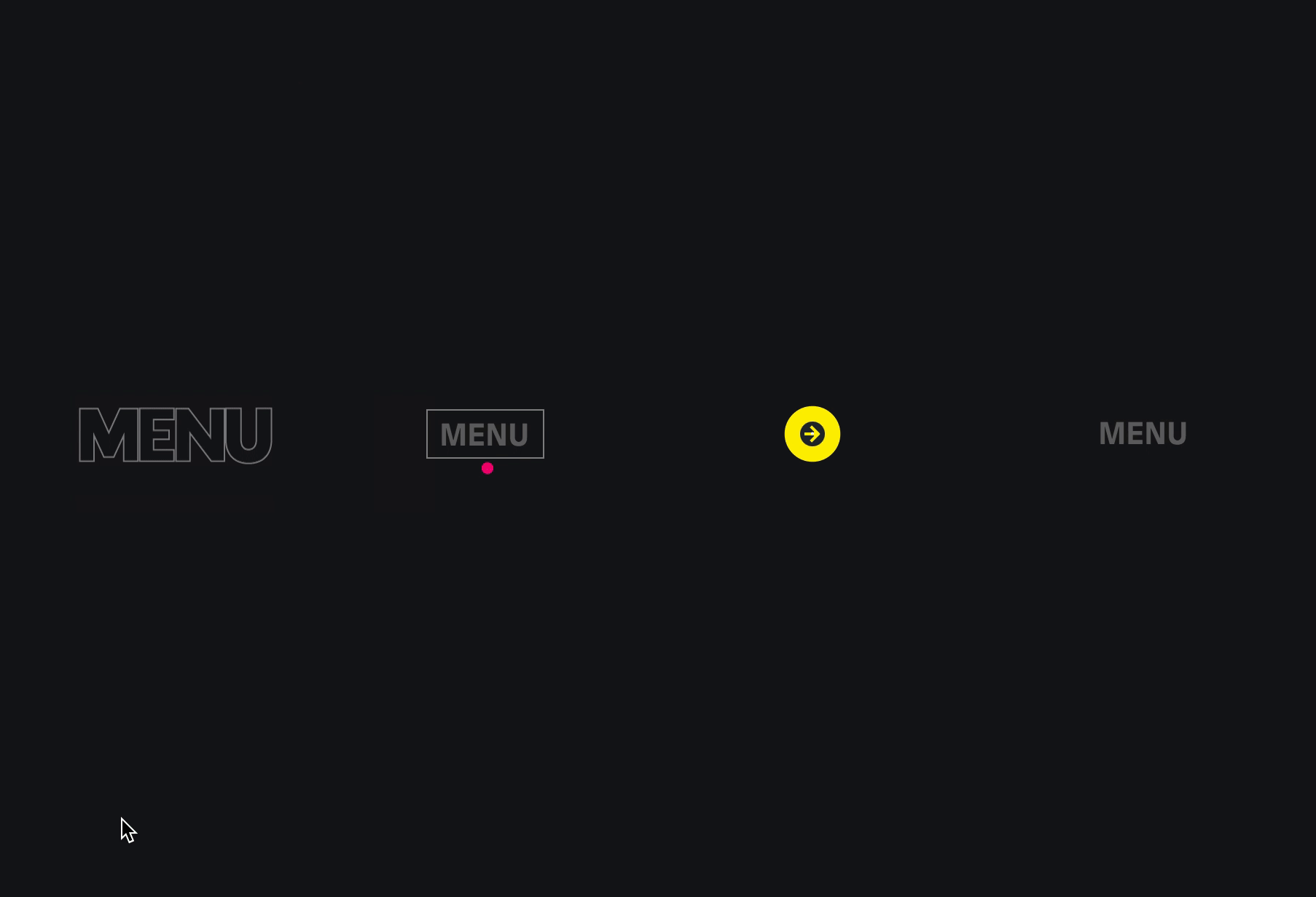
Animations play an important role in helping users understand what action can be taken, if the action has been taken, and alerting us if that action was incorrect. The new animations feature in Tableau has opened a new world of UI design. That being said, please use animations purposefully!
Here's an in depth article on animations in UI.
Simple shapes can absolutely affect perception. Rounded corners are easier on the eyes and may contribute to a nicer, more pleasant user experience. The perceived simplicity is one of the main reasons rounded corners have been popular for a long time. Don’t believe me? Check out this article from 2011. The first sentence reads, “Designers use rounded corners so much today that they’re more of an industry standard than a design trend”. It’s 2020 Tableau, c’mon!
Here's an additional article on using rounded corners for buttons.
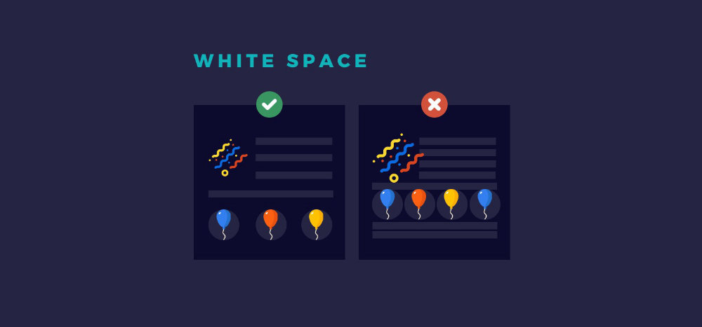
For many, the idea of leaving white space on a dashboard canvas seems counter-intuitive. What possible reason could there be for not utilizing every pixel at your disposal to represent the most amount of information possible? Well the field of psychology has an answer for that.
Cognitive Biases are rational deviations from logical thought. One of these biases is called information bias. This bias plays with our instinctual need for more information. It describes how we seek out more information even if it doesn’t affect action, and more often than not we’re able to make better choices with less information.
Great! So now we know more information does not necessarily get us closer to providing actionable insights for our users. What’s the next step here? Make sure the information we’d like to show is getting the proper emphasis it deserves. White space can help in this regard. Adding more of it does a few things.
You’ll notice that I placed trend inside quotations. I don’t fully buy into the idea that this is some sort of fad that should come and go based on being the “hot thing” at the moment. I believe many of these to be fundamental UI concepts and elements that any designer should have in their back pocket. These will not only help you with building Tableau dashboards, but also PowerPoint presentations, prototypes, posters, websites, etc. If you pair these elements with a firm understanding of C.R.A.P (Contrast, Repetition, Alignment, Proximity) you’ll be well on your way to taking your projects to the next level.
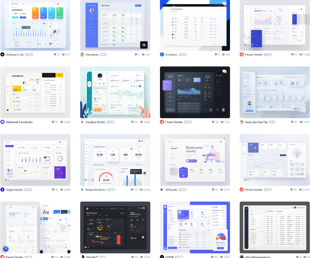
For some further inspiration, below are a few of my favorite examples from the Tableau Community. Or if you're looking for inspiration outside of Tableau, here's a collection I created in dribbble.
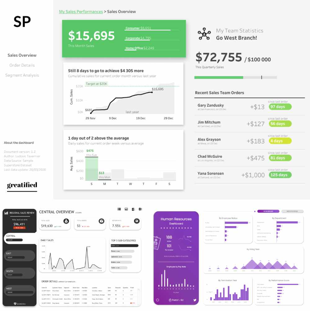
Ludovic T. (Top), Chantilly J. (Bottom Left), Pradeep K. (Bottom Right)
I’m more than happy to answer any questions you may have, don’t be afraid to reach out!


